2014 Design Trends
Simplifying the digital experience
2014 is ushering us into an era of a more succinct, clutter-free design aesthetics. The simplified, flat design trend that Apple started in 2013 will continue to flourish in 2014. This shift in design sensibilities is part due to the massive explosion in the use of mobile devices and part due to the ever-decreasing attention span we all exhibit due to information overload.
Everyday, new services and startups emerge, and if they fail to send a clear message to the already informationally-overwhelmed audiences, they could set themselves up for failure from the start.
This means the push for minimizing the clutter of the internet landscape and the need to capture and sustain our ever-decreasing attention spans are factors that will shape 2014 design trends.
As such, the following components are all part of design trends I expect to truly take hold in 2014:
2014 Design Trend #1: Element Minimalism
Started by Apple’s iOS 7 revolutionary redesign, the desire for reducing visual elements to a bare minimum will be furthered to new heights in 2014. The goal of design is to present content via an easy-to-grasp visual expression, so it is understandable why so many are starting to adopt this approach. The publishing platform Zinio has adopted this “less is more” approach, but the epitome of this principle is still Apple‘s design which positioned the company above the rest of user interface design competition by eliminating all the unnecessary visual distractions.
2014 Design Trend #2: Prominent homepage graphics
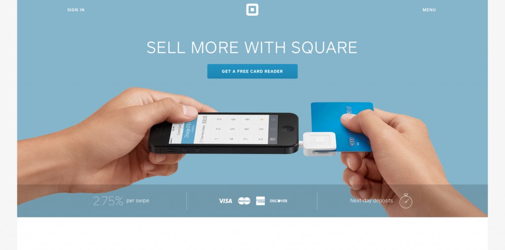
The use of a single image, illustration or video above the fold is another 2014 design trend I expect to see. This center-stage visual area is usually paired with a succinct description about the services offered. This is particularly beneficial for new services and startups that need to present their core values at a glance, so people don’t overlook them. Our attention spans have become so short that websites with vague descriptions and propositions are disregarded entirely.
For an example, view how Square briefly describes what their service does, and why it will be of benefit for their target customer to use it.
2014 Design Trend #3: Simplified color schemes
The overall tendency towards simplicity in 2014 will be reflected in the choice of color as well. The use of a single flat color as an overall color scheme is on the rise.
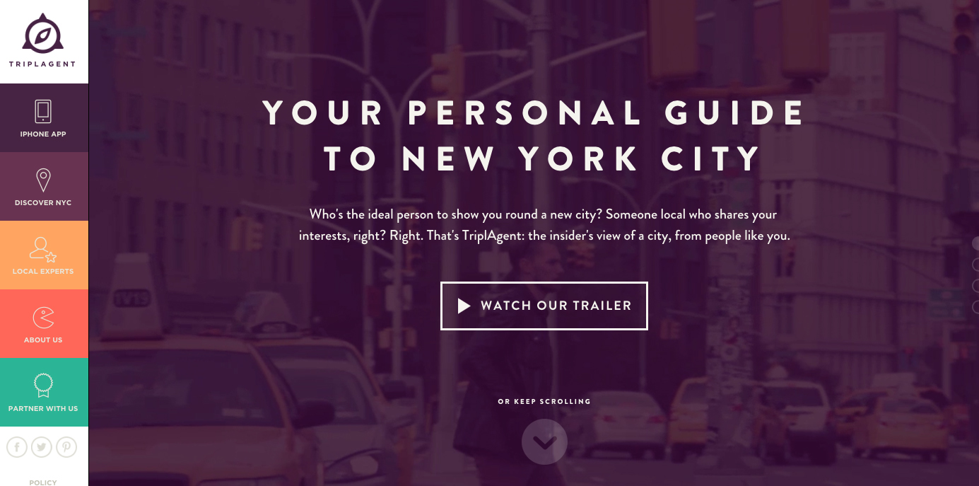
The use of neutrals, such as whites, grays, and blacks is also trending, but they are usually paired with some bursts of color that focus the attention on certain areas of the page. Great examples of this 2014 design trend of subdued color schemes is Vetted, while Triplagent shows the bold use of vibrant, flat colors.
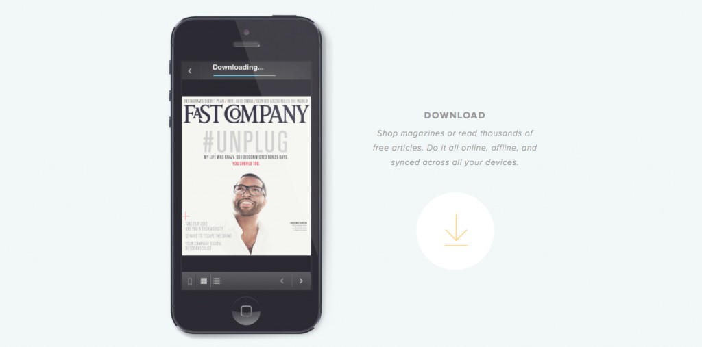
2014 Design Trend #4: Simplified Content Across the Web
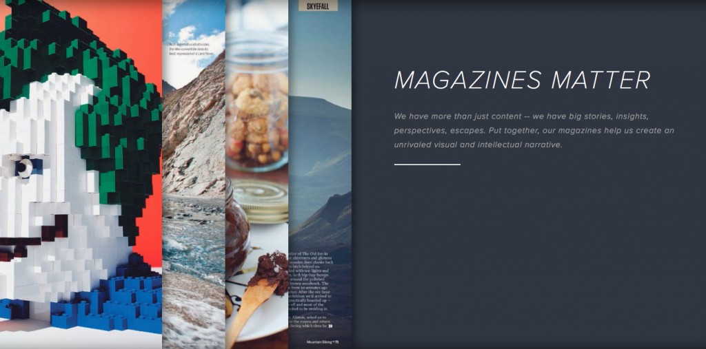
Principles of simplicity will affix themselves in, and to, overall web content in 2014 as well. Above-the-fold areas are not the only areas receiving special visual treatment any more. This trend is exemplified by chunks of information presented in ways that break up and diversify long and visually uninteresting content. These short bursts of high-impact content are on the way to become the norm in 2014 and beyond. Zinio and Tribalmedia’s websites visualize this principle by using information bits on flat-color backgrounds, full-width image areas and in conjunction with graphic elements such as icons and infographics.
2014 Design Trend #5: Improved Web Typography
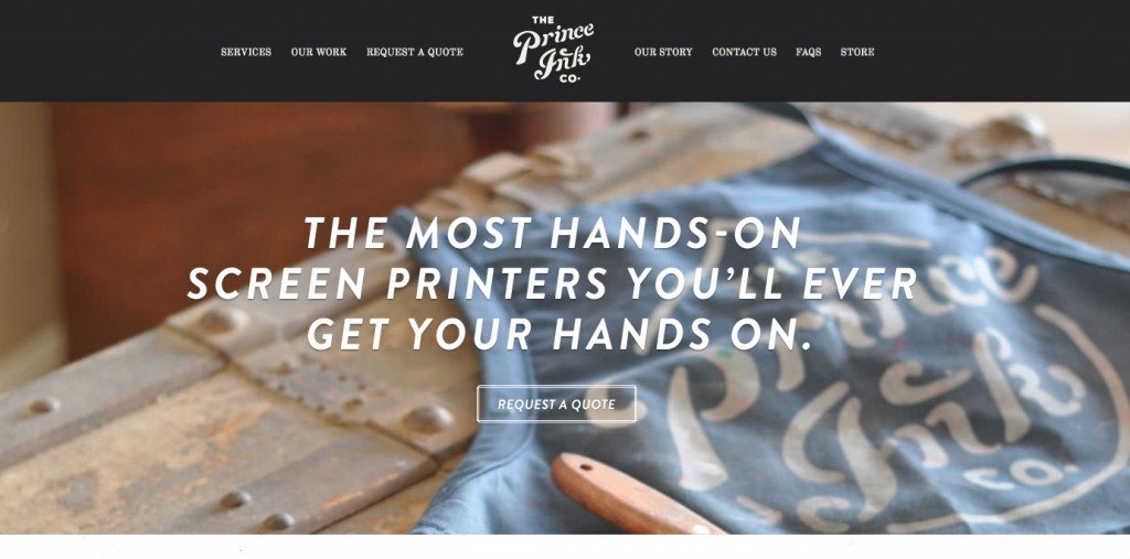
With the rise of cloud font services such as Adobe’s Typekit and Hoefler and Frere-Jones’ Cloud.typography, the future of online typography looks bright. This trend will enable online businesses to invent, reinvent and overall improve their online branding while setting themselves apart from the competition. And, Prince Ink is a print company that utilizes this principle to elevate their brand above the competition.
2014 Design Trends: Final Thought
Design trends in 2014 will continue simplifying and de-cluttering the web. Due to our short attention spans and the ever-increasing complexity of the web, we seek for design patterns that help us grasp information easier and faster. These patterns include monochromatic and flat color schemes, brand-enhancing web typography, prominent above-the-fold website content and succinct information presented in chunks. I will be applying these principles to mobile design especially because the user’s initial perception and interaction with the interface are essential.
About Christina
Christina is an Art Director at Lincoln Digital Group, and has years of experience helping small and big businesses to create, develop and enhance their brand identities. She is a huge advocate of the notion that good design is the basis for good consumer experience and helps clients achieve this by using impactful and clutter-free designs that get straight to the point of the business core values.